Taqaran Consulting Engineers Company aims to provide effective solutions in creating living and working spaces with quality and innovation against the challenges of the city and building through design, consulting and management.
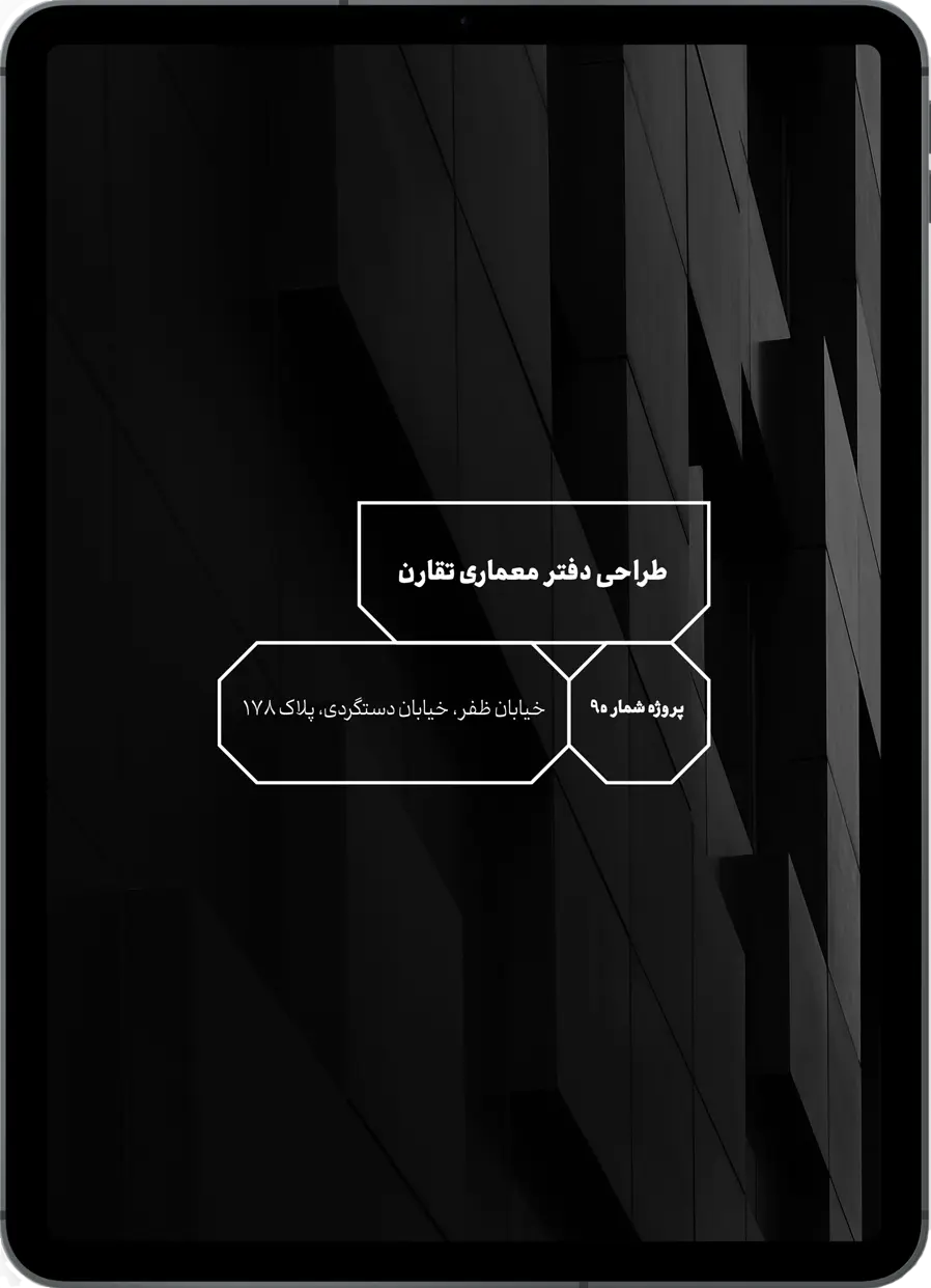
PROJECT NAME : NAQSH HONAR TAQARON
Team : Expression, Experience and Business Development
DATE : 2022
CATEGORY : DESIGN AND GROWTH
STATUS : COMPLETE
PROJECT NAME
Team
DATE
CATEGORY
STATUS
Naqsh Honar Taqaron
Expression, Experience and Business Development
2022
Design and Growth
Complete
Services
Corporate Identity Design | Environmental Graphics | Website Design | Business Development
Taqaron embodies respect, efficiency, and systematic thinking to provide innovative solutions. They approach every project with bravery and aim for stable, long-term success for the clients.
Taqaron Engineering Consultancy is known for its brand attributes of reliability, efficiency, and competence. They prioritize delivering quality work on time and within budget, thanks to their team of highly skilled professionals. Taqaron takes a personalized approach to each client, providing intimate service tailored to their specific needs.
The Taqaron typography logo was designed to represent stability, strength by using square frames , while the playful expansion of the letter “o” adds a touch of technology and youthfulness to the logo. The subtracted triangles at the corners of some letters symbolize modernity and technology. The chosen font is bold and easy to read, ensuring legibility across different mediums. The color scheme was chosen to align with the brand’s identity and values. The result is a simple yet memorable logo that accurately conveys the brand’s message and identity.
The brand’s primary color, Jagged Ice Blue, communicates trust and stability while the Outer Space Grey adds sophistication and formality. The Golden Tainoi Orange represents creativity and enthusiasm, while the Ocean Green color symbolizes harmony and balance. Together, this color palette aligns with the brand’s identity and values, creating a professional, elegant, and creative visual identity.
A set of visual elements were derived from the main logo which are made compatible with the typography used in the logo and can be used for various design applications including print materials, website details, and digital media. the logo’s design features are analyzed and translated into versatile design elements during the process. A set of cohesive and recognizable elements that reinforce the brand identity was produced as the end result.
To create patterns, logo elements are analyzed and tested with different combinations to create visually appealing and versatile patterns that match the brand’s aesthetics. The end result is a set of patterns that complement the logo and add a distinctive visual element to the brand identity. These patterns can be used in various applications such as packaging, products and digital media to create a coherent and recognizable brand identity. They also help strengthen brand messages and make them more memorable to consumers.
Farsi and English typefaces, are inspired by the logo letters and analyze of the design strategy of the whole brand to ensure a cohesive and consistent visual identity. Each letter was carefully crafted to align with the brand’s aesthetic and to be unique and distinctive. The resulting typefaces can be used across various applications to create a recognizable brand identity that resonates with customers in both Farsi and English-speaking regions.
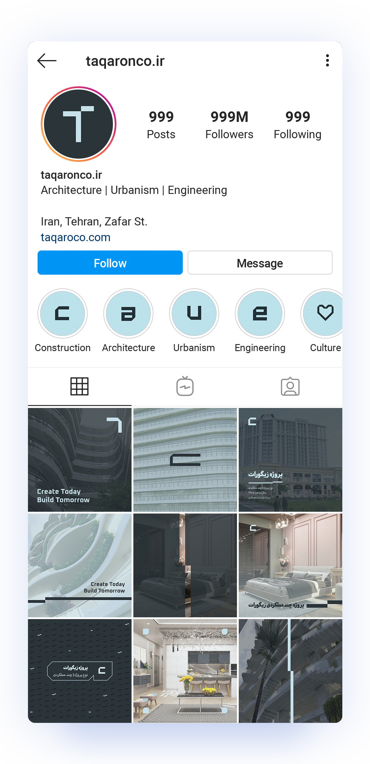
Considering the current structure of the company’s visual identity, the design of icons and graphic signs will be used in the physical environment and documents.
According to the company’s outputs, maps, drawings and technical and non-technical documents will provide a unified identity in this way.
The design of the official stationery set of the company is based on the maximum use of the company’s logo by using various graphic elements and emphasizing the purity, simplicity and stability arising from the conceptual identity of this brand.
The design of the company’s official channels and social media as the most important points of contact and familiarization of the customer group with the brand emphasize on presenting the key values of Taqaron.
Therefore, the maximum potential of the company’s visual identity has been used through coloring based on the main color palette, using the appropriate font in the text, and most importantly, using the logo and its elements.
MINE Team in this project: Mohamad Ebrahimi, Hannan Abagheri, Farshad Moradabadi, Saghar Yazadani